www.magritti.com
Version 1 → Version 2.0
Category
Words by

1
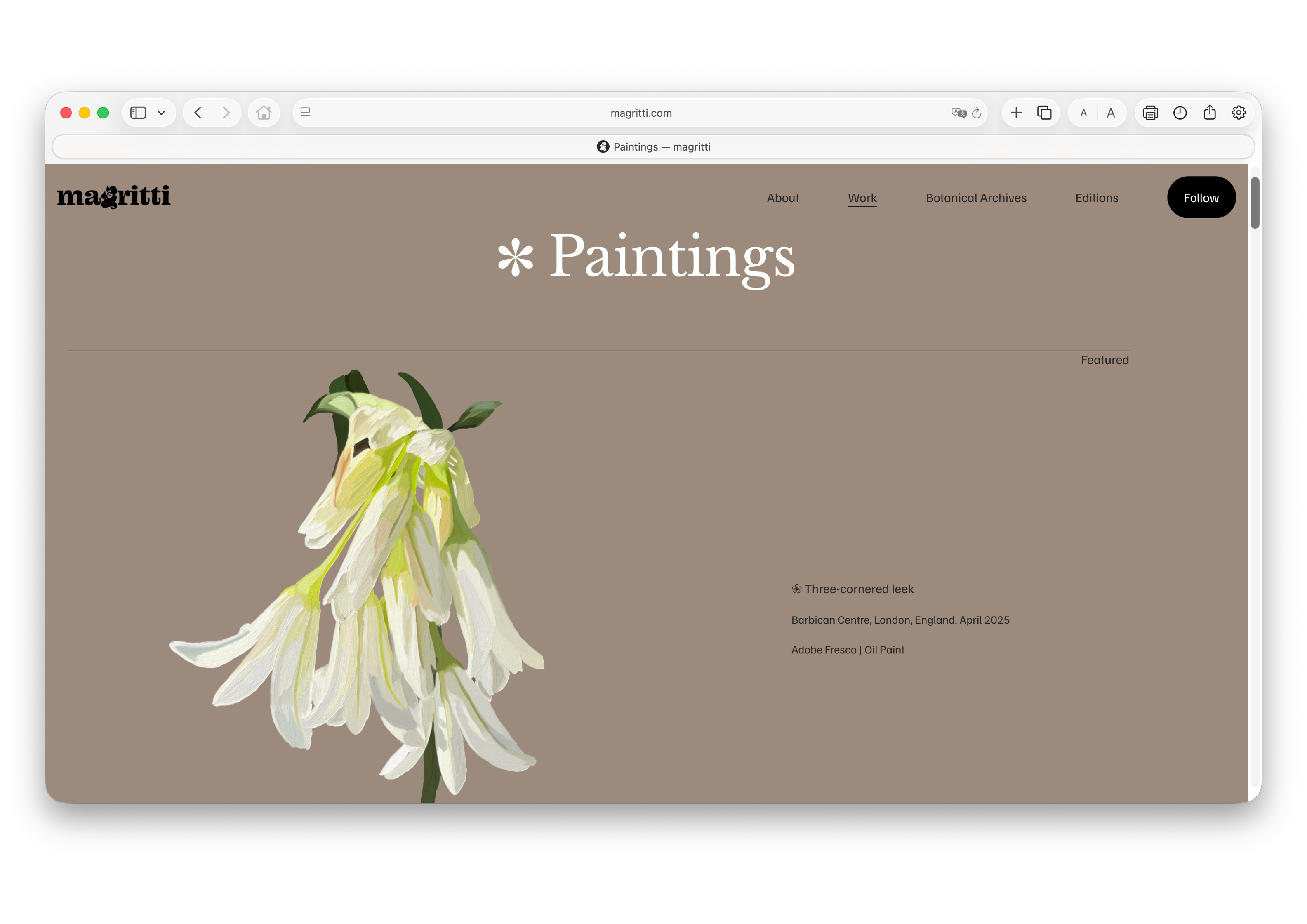
Someone in advertising looked at the website and said it felt like a gallery. The work was up on the walls, but nothing said why to look. It was all there except the reason.
That was fair. The first version lined the work up in a row, one project after another. A visitor scrolled past the images without learning what any of it was, or why I made it. For a while I thought I needed more work, so I kept adding. But the problem was not how much work I had. It was that none of it held together. So the second version did not start with the design. It started with what to put in it.

2
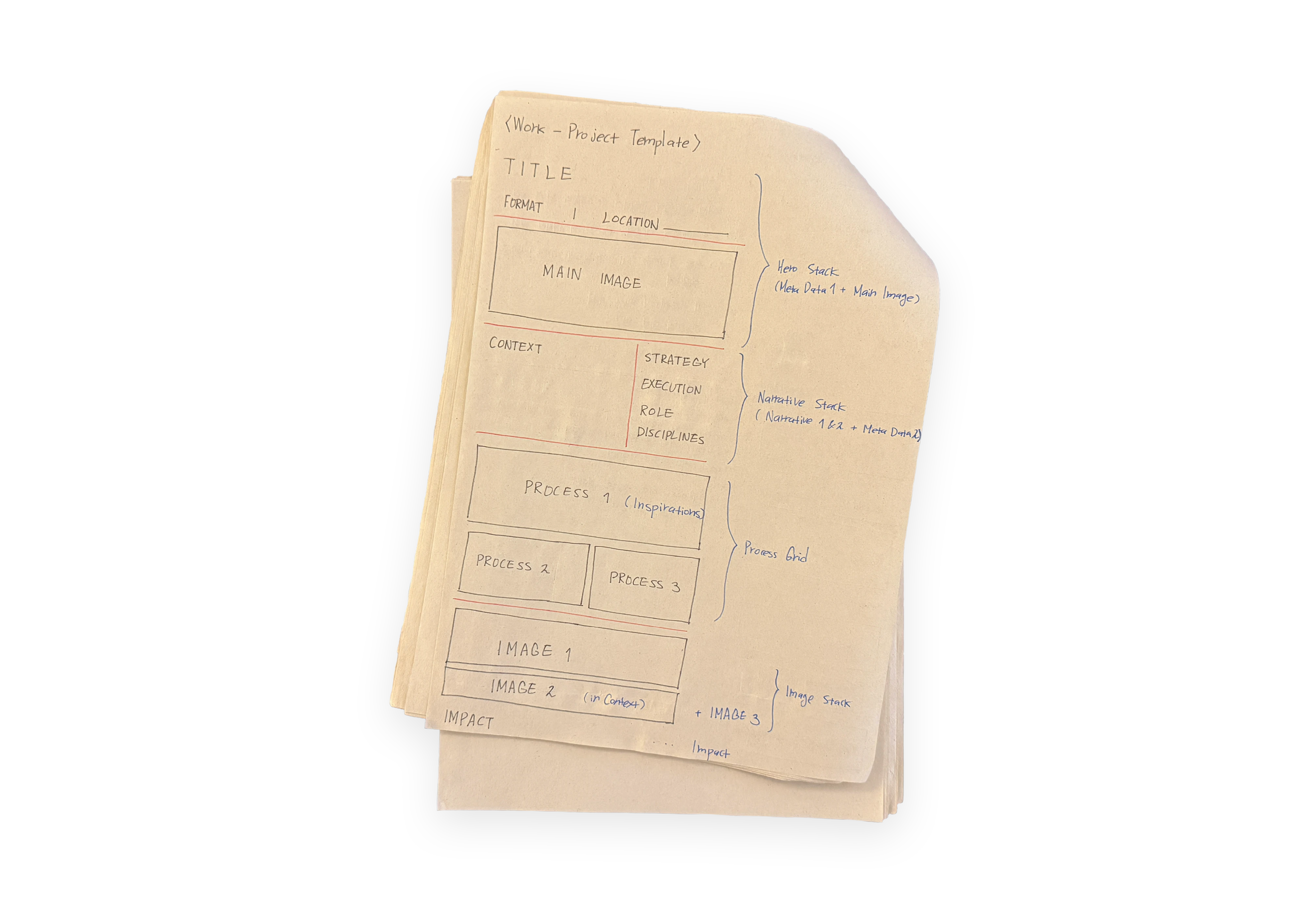
I split a project into eight fields. Format, Location, Context, Strategy, Execution, Role, Disciplines and Impact. Every Work runs through them in the same order. The hard part was the border between them.
Context, Strategy and Execution kept running into each other. Why I did it, how I thought about it, what I made. The three are clear on their own. Then I put a real project into them and they blur. A sentence I meant for Strategy would turn out to be a list of what I did. A sentence under Execution had a decision inside it.
So I set a rule. Strategy is what I did in my head. Execution is what I did with my hands. One is the concept, the other the action. I hold a sentence up and ask if it is a thought or a move, and the field is obvious. That one rule fixed all eight.

3
Once the fields were set, I needed a structure to hold them. The website has four parts. Work holds the projects. Notes is where writing like this goes. About says what the studio is. And the Shop sells the clothing from Work 3. Work needs a tight frame, Notes a loose one.
The first thing was UX, the path a visitor takes. Before I added pages, I mapped where each one leads and where it stops. Without that, the pages pile up and the route through them is lost.

4
Putting it on the screen was the most hands-on part of the build. Anything that repeated across pages I made into a single component, so one edit would carry through all of them. I set the fonts and colours as shared styles, used everywhere from one source. I decided how pages moved from one to the next, how things loaded in, and wrote custom code where the tools ran out. Responsive was part of this too. A Work that ran in two columns on a desktop had to fold down to one on a phone, and the reading order had to hold. These decisions became the second version.