About
Words by Seong Te Park

Where Nature Becomes Brand Strategy
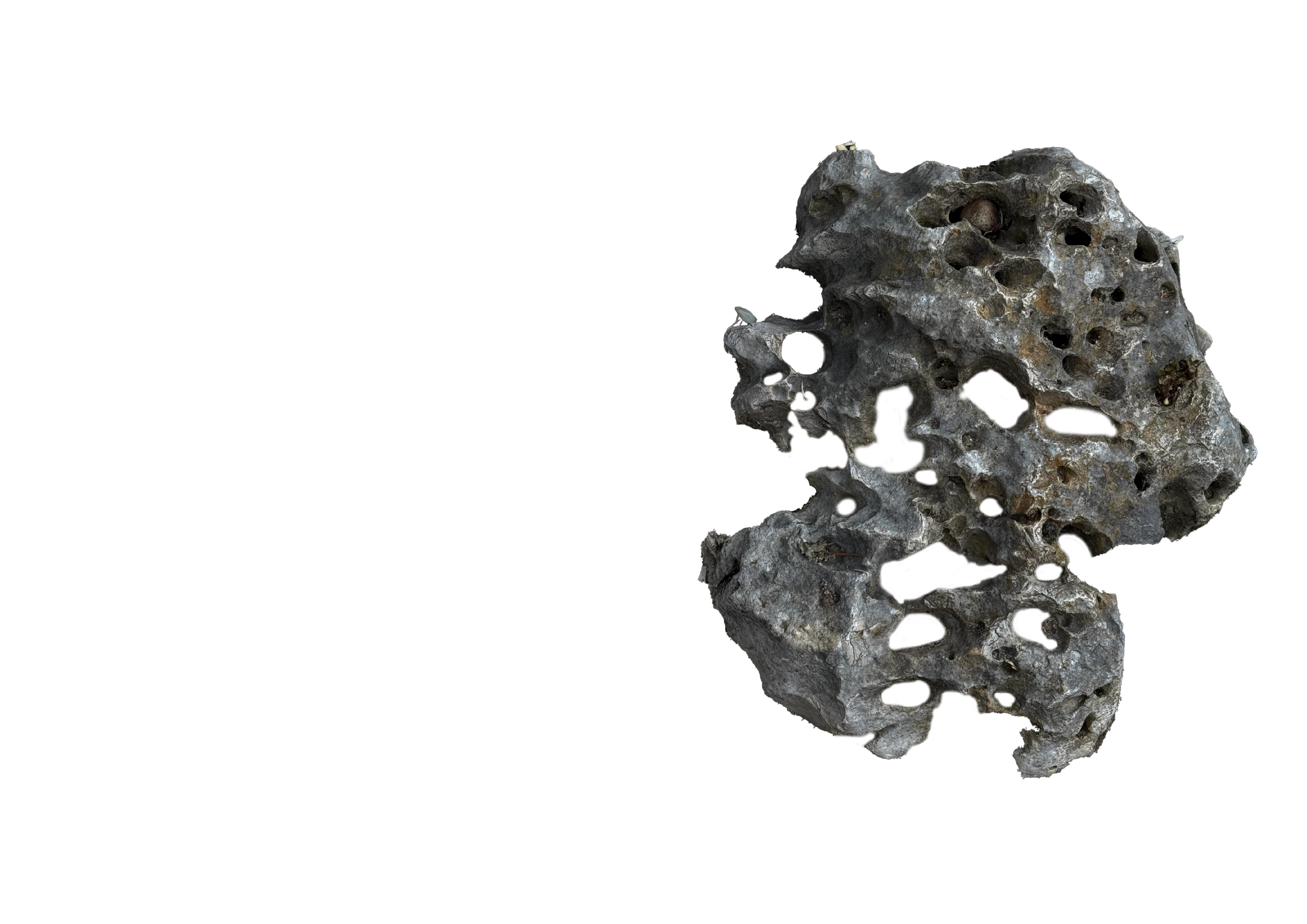
Magritti is a London-based creative studio built on a premise: nature is not just inspiration, but the oldest visual language there is. Long before typography, grids or brand guidelines existed, flowers and botanical forms were humanity's first decorative system, the original way of making something ordinary look intentional.
Magritti observes that language, breaks it down and translates it into brand strategy and creative execution. Every project begins with a visual encounter in the real world and ends with something a business can use.
Observation as Method
1

Magritti's working method borrows from museology and archiving. Catalogue what exists before deciding what to make. The starting point is always the world outside. Travel, walks, unfamiliar cities, botanical gardens, quiet corners of familiar places. A plant catches the eye. A colour relationship comes together in an unexpected way. Something gets noted down, photographed, sketched. That becomes the seed. From there the process follows a consistent pattern.
Brief & Research | Every project starts with a brief, even when Magritti is writing it for itself. Who is the audience? What is the context? What does the brand actually need, rather than what it thinks it wants? Observation is set against this context before anything else happens.
Strategy & Territory | The visual encounter is broken down into its working parts. Form, colour, structure, relationship. These become the key message, and the message opens up a territory that a campaign can be built around.
Creative Execution | The direction is built out across formats. Acrylic painting, digital design, short-form video, product photography, poster, packaging. The medium follows the message, not the other way around.
Review & Delivery | The final output is reviewed through two lenses. Does it hold up as creative work? Does it function as media? If it fails either test, it goes back.
The Full Cycle
2

Magritti covers the complete arc of a brand project. Strategy, creative direction, production planning and post-launch analysis all run through the same operation.
The work falls into four areas.
Brand & Concept | Positioning, identity system, audience definition. This includes the full rebrand carried out in November 2025, run as a live project with its own brief, strategy and rollout plan.
Creative | Campaign direction, art direction, copywriting, all handled in-house. The visual outputs shift depending on the project, from acrylic and digital painting to short-form video, photography, poster and packaging design. The principle stays the same. The creative serves a specific strategic message.
Media & Distribution | Channel planning across social, web and physical formats. Paid social campaigns set up and run in Meta Ads Manager, with target locations revised as results came in. SEO strategy. Platform-native content informed by how vertical video performs across feeds.
Production & Operations | Budget management, logistics and business registration in South Korea, with import and distribution operations in the UK.
The Pivot
3

Magritti launched with a tone that did not reach far enough. Social media growth stalled early, and neither content volume nor format variation moved it past that ceiling. The audience boundary was real, and posting harder at the same wall was not going to solve it.
The response was to read the data. Meta Business Suite analytics suggested that reach was concentrated within a narrow demographic and geographic band, with the same viewers circulating through the same posts. New audiences were not coming in. The content reached people who had already found it, but did little to expand the audience. The diagnosis was twofold. An audience problem underneath, a tone problem on top. The original identity leaned towards the sentimental in a way that resonated with a small circle and closed the door on everyone outside it.
In November 2025, the studio underwent a full rebrand. New logo, new symbol, new visual system, new tone. The previous work was not discarded. It had done its job in defining the ground Magritti started from. The data simply said that ground had been exhausted, and that reaching further required different signals.
A brand that cannot read its own performance is a brand that stops growing. Every campaign is a draft, every launch is a measurement and every rebrand is the studio responding to what the work itself has said. The pivot is not an event but a working condition.
The Origin
4

English-speaking friends often pronounced my name as Siong-Ti. I liked the rhythm, so I paired the 'Ti' with the surname of René Magritte, a painter whose career began in commercial design and who kept moving between commercial work and fine art for most of his life. What drew me to him was not only that dual practice, but the way his paintings take familiar objects and make them strange again. Flowers, pipes, apples, skies. The same logic put a hibiscus sketch from a 2012 trip to Hawaii into the studio's first logo. Ordinary things, held slightly off-centre, become worth looking at.
My name is Seong Te Park. I studied Media and Communication in South Korea and completed an MA in New Media in the UK, where my dissertation looked at how vertical video performs as a platform-native format. London is where that research turned into practice, and Magritti is what came out of it.
I work as a Creative Strategist. The label shifts between brand, advertising and design depending on the project. The work itself stays the same. Observe carefully, structure clearly, build something that holds up beyond the brief.