Rebranding Magritti
Format
Brand Identity · Visual Identity System
Location
London
Disciplines
Brand Strategy · Brand Identity · Visual Identity
Role
Creative Strategist · Designer
Context
Magritti rebuilt its identity. The logo, the typefaces and the colour were all redrawn together.
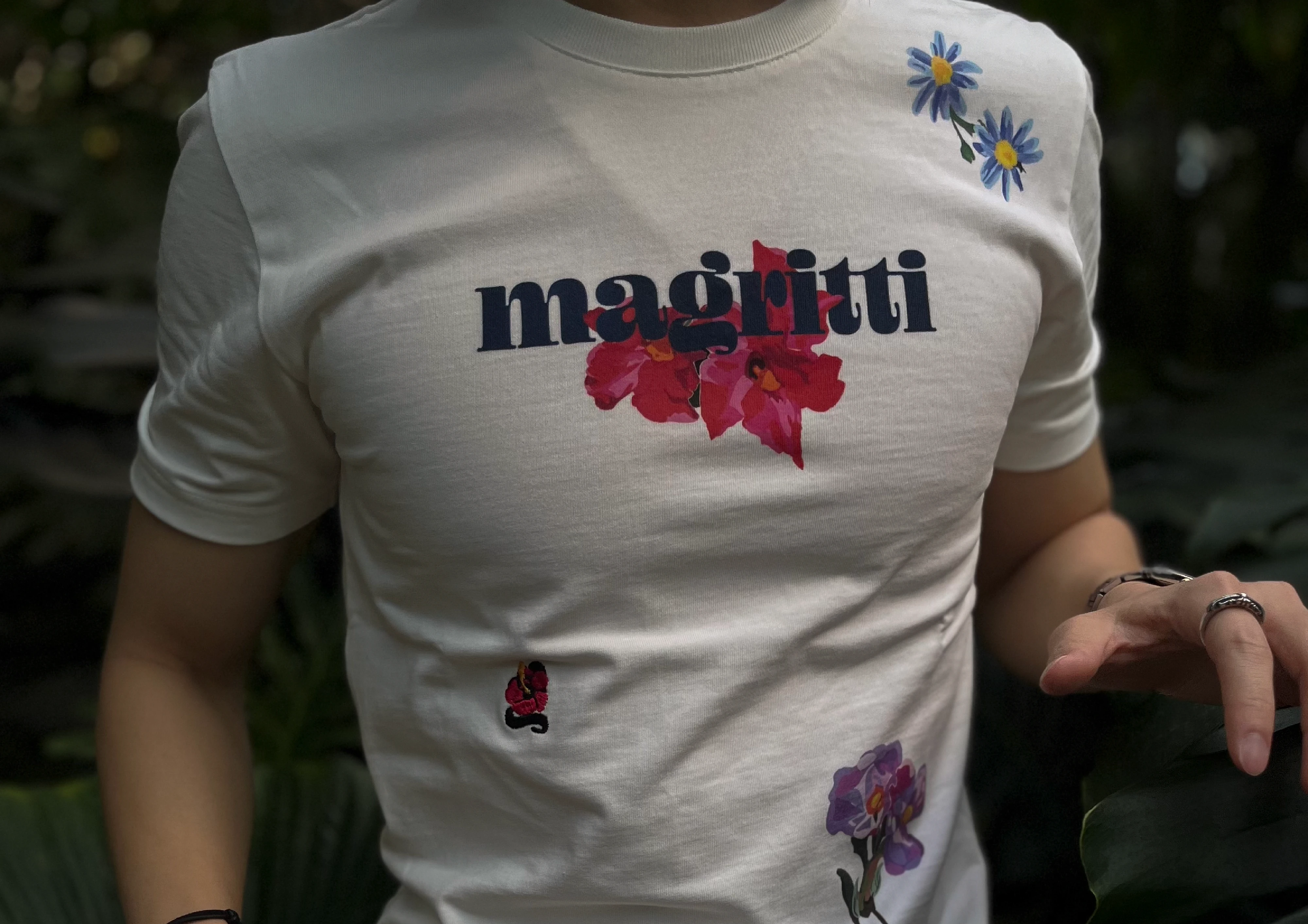
The first identity was made for a launch, when the logo had to do the introducing on its own. The hibiscus was set into the wordmark in place of the g, so that the name and the subject would land in one look. The flower ended up reading as part of the lettering.
What the logo was being asked to do changed as the studio put out campaigns, paintings, clothing and zines. Each of those projects stood for Magritti on its own, and the introducing was no longer the logo's to do.
Strategy
Take the flower out of the wordmark and pull the type and colour back, letting the projects read first.
Execution
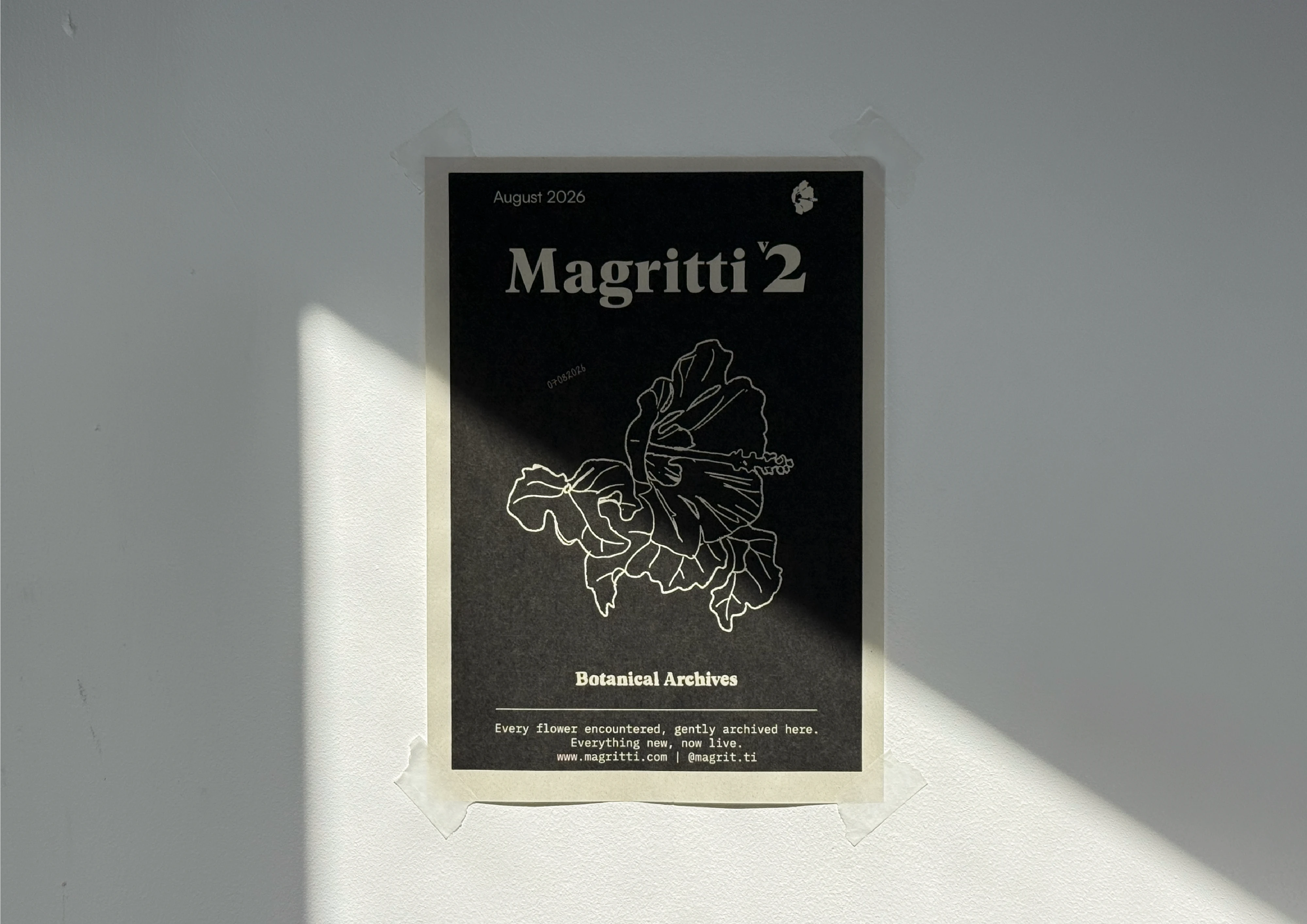
Logo — The studio looked back at the hibiscus it had drawn over the years for one that would work as a symbol. A specimen at the botanical garden in Copenhagen came down to the fewest lines, and that is where the symbol came from. It keeps the detail of the flower and still works small. The wordmark and the symbol were separated and set as a lockup, with the rules for it fixed in a specification document.
Type — The top of the hierarchy went to a serif. Geller Headline runs the logo and the headings, with Satoshi and IBM Plex Mono beneath it, kept neutral to let the serif carry the tone.
Colour — The logo runs in two versions, colour and mono. Mono is the default. Red and yellow carry the colour version and the accents on the site and in the interface.
Social — The account's posts are built on the new system.
Context
Magritti rebuilt its identity. The logo, the typefaces and the colour were all redrawn together.
The first identity was made for a launch, when the logo had to do the introducing on its own. The hibiscus was set into the wordmark in place of the g, so that the name and the subject would land in one look. The flower ended up reading as part of the lettering.
What the logo was being asked to do changed as the studio put out campaigns, paintings, clothing and zines. Each of those projects stood for Magritti on its own, and the introducing was no longer the logo's to do.
Strategy
Take the flower out of the wordmark and pull the type and colour back, letting the projects read first.
Execution
Logo — The studio looked back at the hibiscus it had drawn over the years for one that would work as a symbol. A specimen at the botanical garden in Copenhagen came down to the fewest lines, and that is where the symbol came from. It keeps the detail of the flower and still works small. The wordmark and the symbol were separated and set as a lockup, with the rules for it fixed in a specification document.
Type — The top of the hierarchy went to a serif. Geller Headline runs the logo and the headings, with Satoshi and IBM Plex Mono beneath it, kept neutral to let the serif carry the tone.
Colour — The logo runs in two versions, colour and mono. Mono is the default. Red and yellow carry the colour version and the accents on the site and in the interface.
Social — The account's posts are built on the new system.
Context
Magritti rebuilt its identity. The logo, the typefaces and the colour were all redrawn together.
The first identity was made for a launch, when the logo had to do the introducing on its own. The hibiscus was set into the wordmark in place of the g, so that the name and the subject would land in one look. The flower ended up reading as part of the lettering.
What the logo was being asked to do changed as the studio put out campaigns, paintings, clothing and zines. Each of those projects stood for Magritti on its own, and the introducing was no longer the logo's to do.
Strategy
Take the flower out of the wordmark and pull the type and colour back, letting the projects read first.
Execution
Logo — The studio looked back at the hibiscus it had drawn over the years for one that would work as a symbol. A specimen at the botanical garden in Copenhagen came down to the fewest lines, and that is where the symbol came from. It keeps the detail of the flower and still works small. The wordmark and the symbol were separated and set as a lockup, with the rules for it fixed in a specification document.
Type — The top of the hierarchy went to a serif. Geller Headline runs the logo and the headings, with Satoshi and IBM Plex Mono beneath it, kept neutral to let the serif carry the tone.
Colour — The logo runs in two versions, colour and mono. Mono is the default. Red and yellow carry the colour version and the accents on the site and in the interface.
Social — The account's posts are built on the new system.


Impact
The website is the first application. magritti.com is being rebuilt on the system, with the social assets made to match.